Zagging when others are zigging
Branding, Identity, packaging
Client Contact:
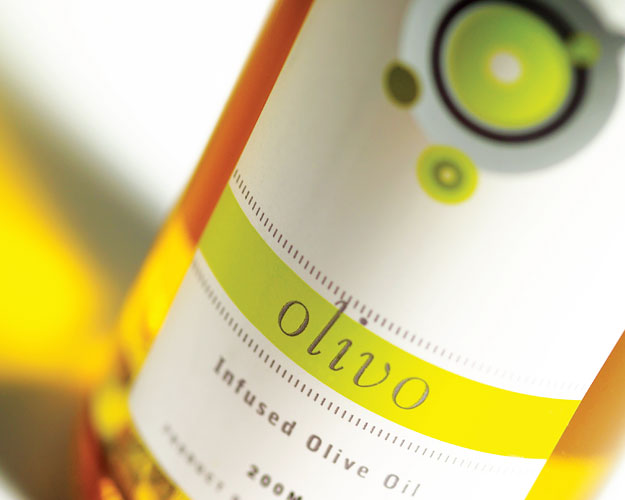
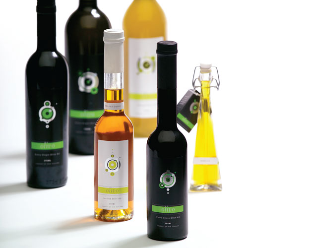
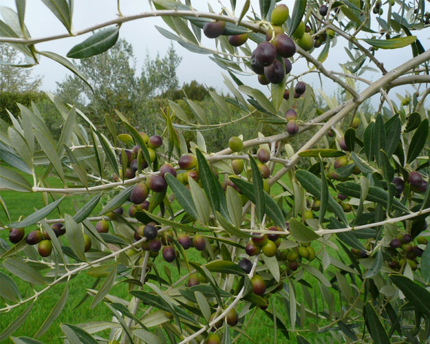
Helen MeehanOlivo was a reasonably successful South Wairarapa olive producer when my client Helen Meehan bought the grove and property. The old brand was very expected; dark green, gold with the obligatory picture of an olive and sprig.
Helen was extremely open to being led, putting a lot of trust in the process I took her through. She also knew she had to be brave to make what she wanted to do work. Her desire was to raise the stakes completely; against her better judgement she decided to go for the most radical solution I proposed.
The quality and reputation the old business had was intact, but she wanted to push the quality of the product to the nth degree. She knew she had to beat everyone on quality to become a successful niche player, but she knew she had to beat them all on brand first.
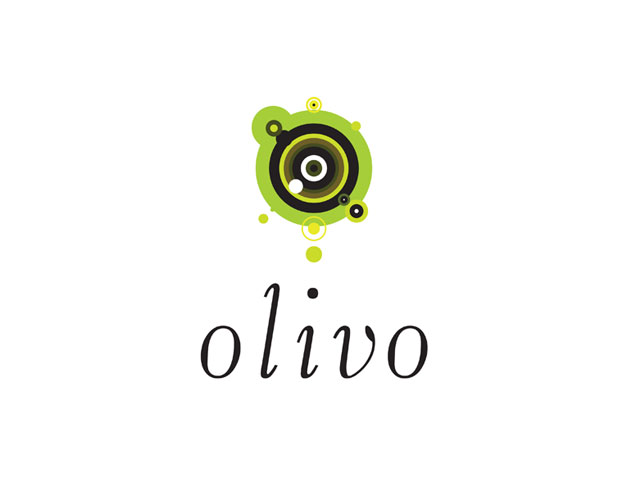
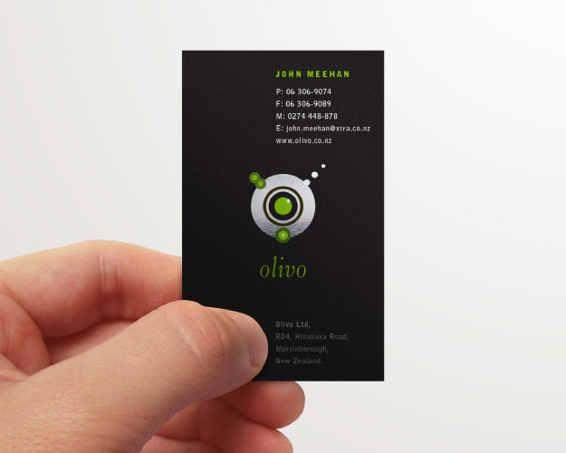
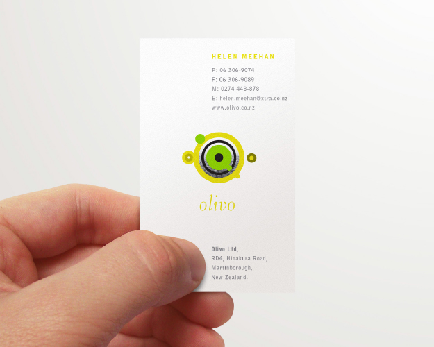
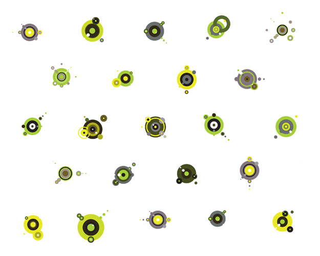
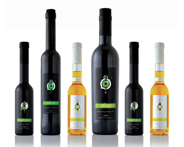
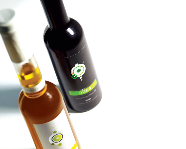
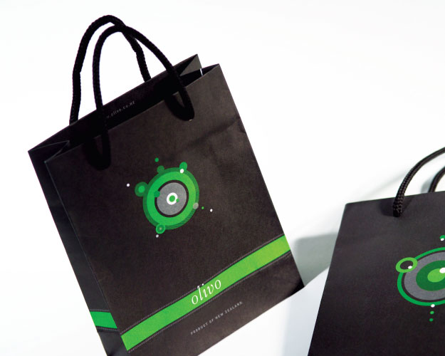
I proposed a never-repeating lockup for her brand. The circles represent droplets of oil, but more importantly go some way to try and describe the astringent nature of the fine oil she produces. None are ever the same, this being the very nature of fine oil, that no one pressing will ever have the same flavour or character.
Thus the positioning I came up for her: ‘Out front by a nose.’
She has had never ending successes. Gold medals, much increased traffic to her tasting room, plaudits from fine restaurants, but more than anything else, the satisfaction knowing it was a job well done. Well, a job well enough done to garner a Best Award and a wee feature in Graphis…