Brands that define the Nation's identity
Branding and Identity
Client Contact:
Fraser HollandHugh HendersonCollaborators:
Grenvile MainCharlie Ward
Kris Sowersby
Sam Hughes
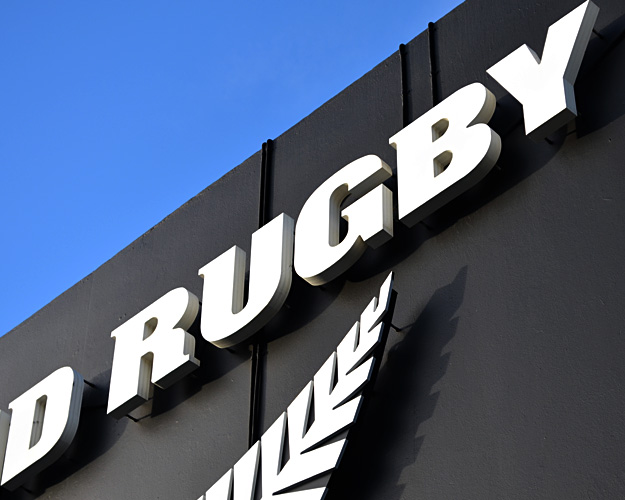
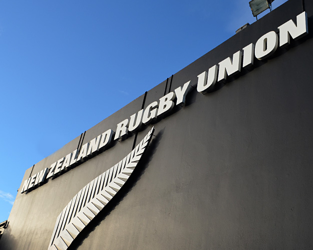
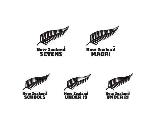
The revisions to the NZRU stable of brands came about as part of a much wider brief from the NZRU to tighten up protection measures around all its brand, particularly the All Blacks and associated identities. NZRU was under an international onslaught of rip-off and knock-off merchandise, and there had been no adequate measures in place to protect the fern marks internationally.
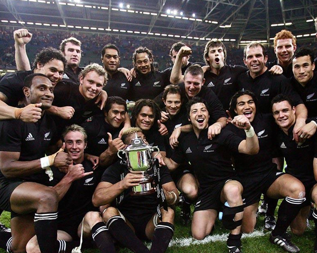
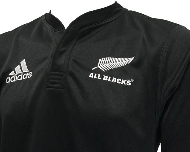
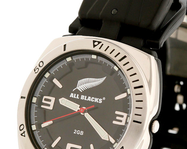
The All Blacks logo was given priority during the build up to the 2003 Rugby World Cup. An extensive exercise in repositioning the whole Union was undertaken, with even more radical changes to the brand proposed. In the end, pragmatism won the day, and only a slight re-engineering of the mark was undertaken, with all nomenclature within the NZRU family being given the treatment with a new proprietary typeface design.
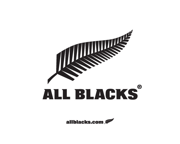
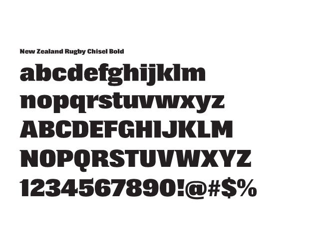
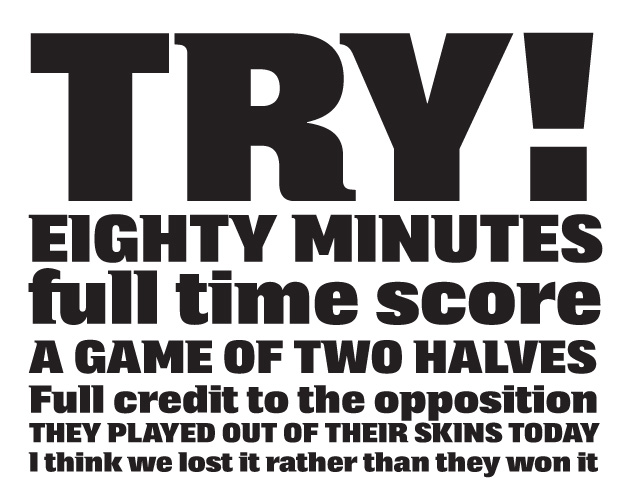
Over a period, all marks in the stable were re-litigated, each receiving the new balance, based on the All Blacks mark architecture, and the new font. Much of the detail worked through for application of the NZRU typeface in the early stages was carried through into the final design, which was handed over to Kris Sowersby, from the Klim Type Foundry, a renowned local typeface designer for finishing and polishing.
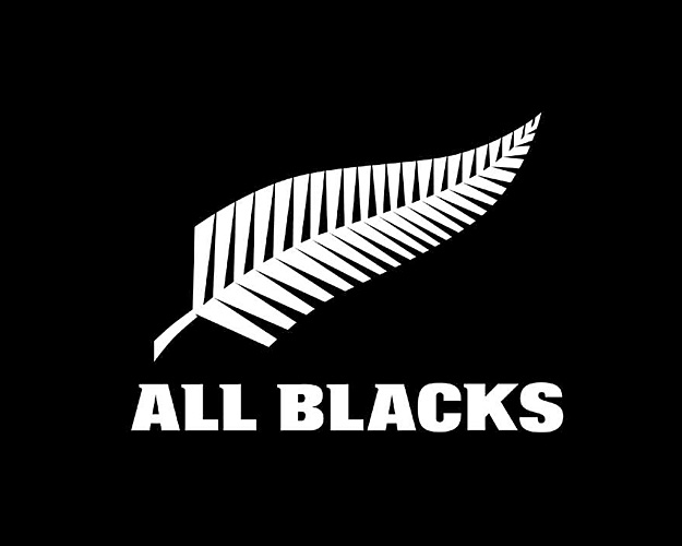
The name of the font, NZRU Chisel Bold, comes from a staunch young woman who reckoned the All Blacks (predominantly Dan Carter I think) were ‘chiselled’.