Giving a nod to the weekend warriors
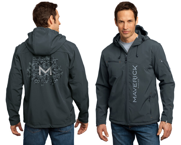
Branding and packaging
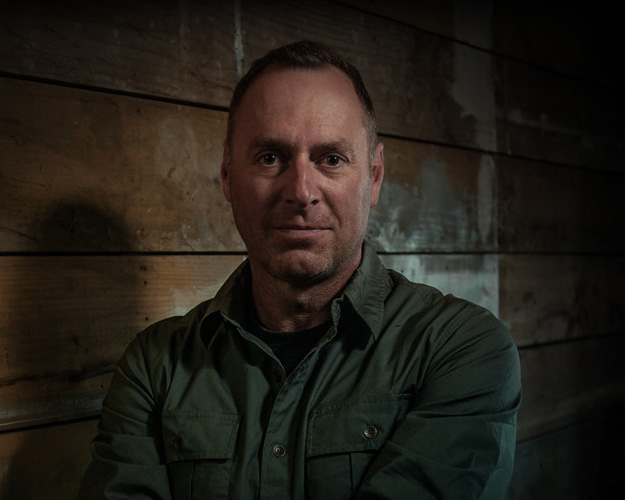
Client Contact:
David McLellanCollaborators:
DNA:Grenville Main
Zakary Kinnaird
Photography:
Murray Llyod
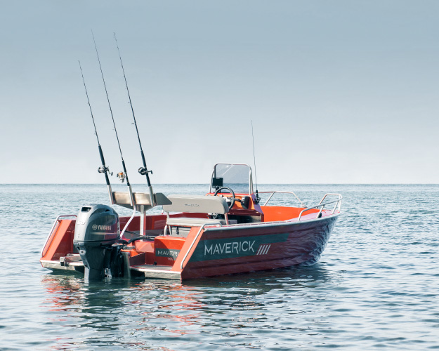
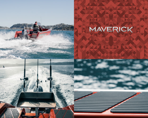
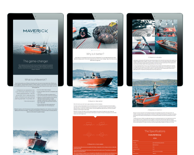
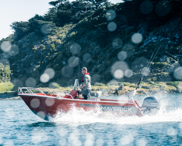
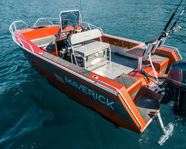
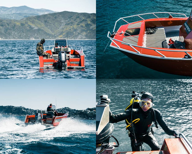
Maverick is one man’s vision that is challenging the way the sport boat should be built. Maverick has seen all the deficiencies in current boat design and wanted to create a boat that was safer, had greater ride comfort, offered stability in rough water and was easy to use as a hunting and fishing platform. He also wanted to design a boat that looked the part, and offered something fresh for willing weekend warriors.
Convention overrides innovation and people take a lot of convincing of new ideas. These purchases are significant; often coming second only to the family home.
This product is new to New Zealand, so preconcieved barriers about twin hull boats (and the so-called ‘cat sneeze’) had to be disolved and benefits highlighted. Other boat builders simply meet category expectations, we needed to be set apart to be get consideration.
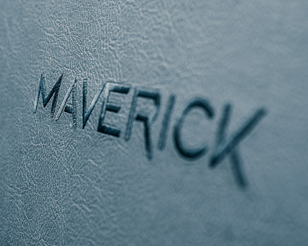
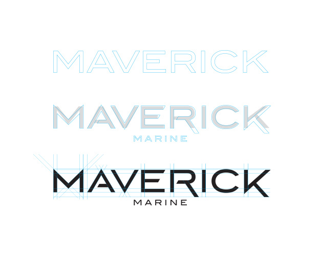
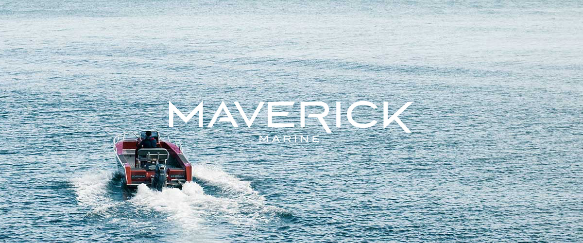
It needed to be a brand that was attitudinally set apart. The name ‘Maverick’ was a good place to start. My client believes in the notion that ‘you’ve either got to go hard or go home’.
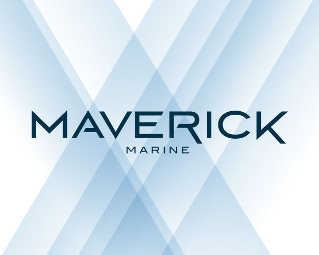
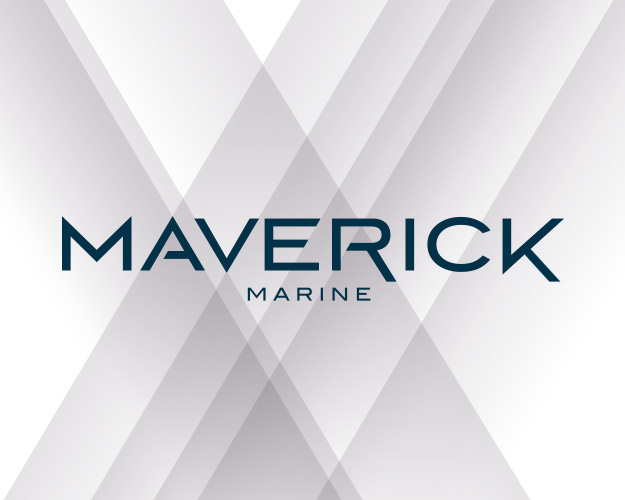
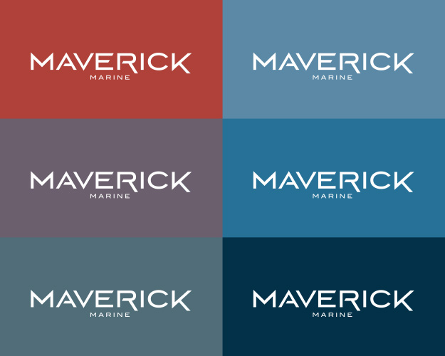
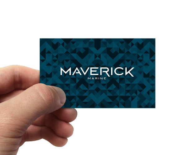
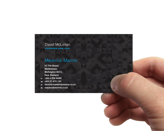
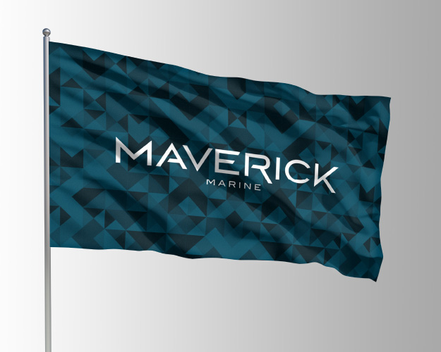
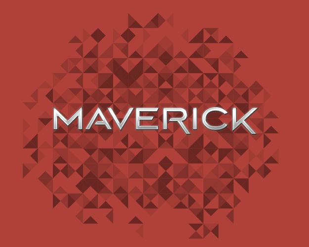
‘Premium’ was deliberately used as a differentiator; typically not encountered at this end of marine products (tinnies). The design execution is a piss-take. A gentle finger raised at other plastic-fantastic sailors on the ramp. The half-million-dollar-boat lexicon became the hallmark of the execution; an engineered wordmark (that totally suits chrome), a geometric pattern that evokes rippled water (or Louis Vuitton); colour palettes, livery, type selection and photography style; all the cues of a design system that says this boat that not only does the business, but looks the business too.