Creating greater meaning around a family story
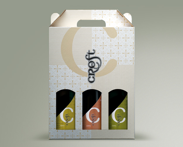
Packaging
Client Contact:
Peter and May CroftCollaborators:
James CroftDNA:
Christine Arden
Coming out of senior management from a large accountancy company, Peter Croft was looking for something of a more sedate lifestyle. Being near Wellington they relocated to Martinborough and planted acres of grapes. May Croft was still a practising Anglican vicar. Interestingly, a ‘croft’ is a parcel of land set aside for a minister of the cloth to grow his own food on.
They gradually ramped up production to four varietals, olive oil and a range of chutneys.
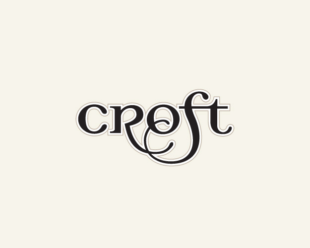
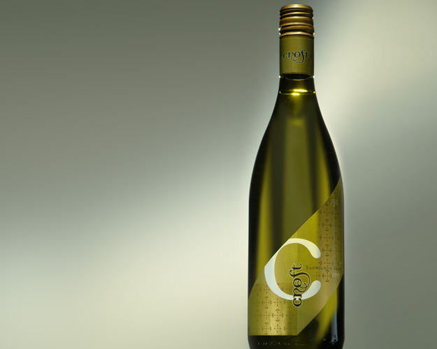
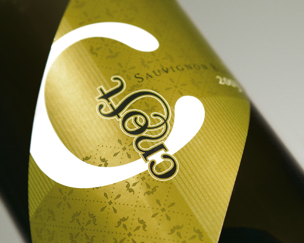
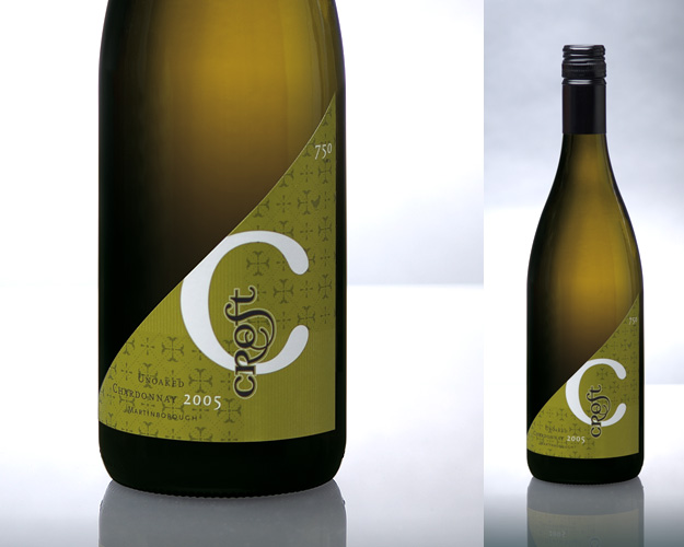
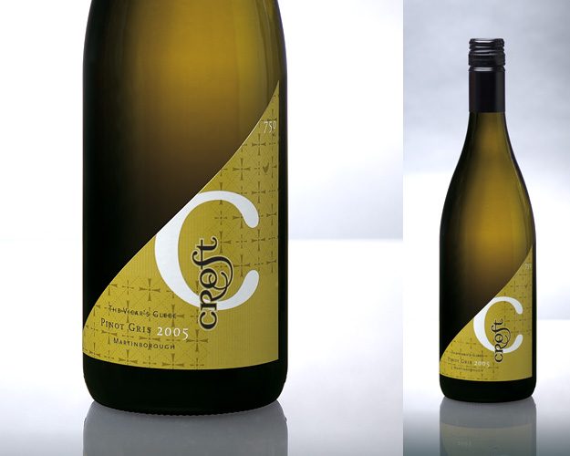
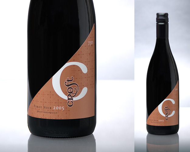
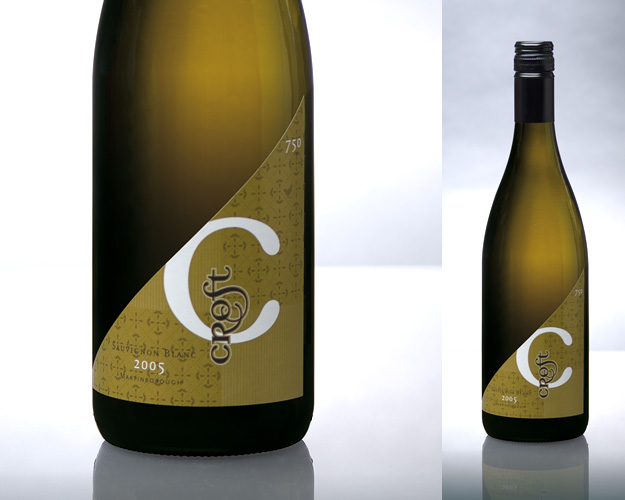
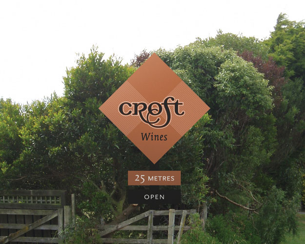
They were looking for something that felt personal, and reflected their tight family unit. The result is somewhat ecclesiastical in nature, a strong quadrant in the background of the labels. As a point of difference, each label was cut on a strong angle and defined by a large ‘C’. The logotype is hand-drawn, feeling a lot like a traditional colophon or family mark.
There was a great story of James (the son) giving his mother a rooster for one of her birthdays (which she hated). This has become part of family folklore. The rooster now makes a hidden appearance on each label.